As the Paris 2024 Olympics draws to a close, Newsweek spoke with four experts on art, branding and marketing who reflected on the most iconic and infamous Olympic logos and mascots from Paris 1924 to LA 2028 and the magic behind a successful mascot and logo.
Sunita Yeomans, Course Leader of Graphic Branding and Identity at London College of Communication, University of the Arts London (UAL) told Newsweek that the Olympics logo is “The official identify of the Olympics held in the host country. It needs to have gravitas whilst being filled with symbolism and meaning.”
“In recent times, Olympic Logos have become increasingly contentious and scruntized by the general public and media rarely celebrated. The expectation for this one symbol to represent an entire nation and please ever single person is one of the hardest events in the games itself,” Ben Wright, Founder and Managing Director of DesignStudio told Newsweek.
Wright added that, “The symbols of these brands can sometimes try and work too hard and tell too many stories.” Wright also told Newsweek that, “When DesignStudio created the Airbnb symbol it had to work really hard to tell a really authentic story and compact that into a simple elegant logo. Much the same with Olympics Logos.”
Stewart Hodgson, the co-founder of Fabrik Brands told Newsweek that “Successful Olympic logos and mascots embody a blend of cultural significance, visual simplicity, and timeless appeal.” For Modej Sakaki, Director of Fashion & Interior Design Programs at Salt Lake Community, it’s about “Designing a logo that incorporate symbolic imagery that represents the Olympic ideals of sportsmanship, unity, and global community is not easy to achieve. The logos that represent clean, and minimalist design are easier to recognize and recall,” she told Newsweek.
While the “Olympic mascots symbolize the values and culture of the host country, promote the event, and they serve as ambassadors to spread the Olympic spirit. They help humanize the Games, making them more accessible and engaging to a global audience,” Sakaki explained. Yeomans echoed this statement, explaining that: “A mascot is a friendly, approachable character that personifies the Games. A great mascot should be like our favorite children’s animated cartoon characters.”
The Best Olympic Logos and Mascots
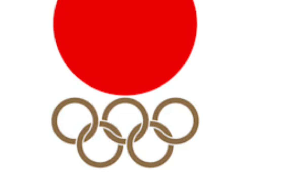
The 1964 Tokyo Logo
The Tokyo Olympic Logo stands out as a clear favorite. Ben Wright explained that “The 1964 Tokyo Olympics is beautiful, simple and refined. It tells the story of the nation and its history with one simple graphic device.” Stewart Hodgson added that, “With its minimalist logo and incorporation of the red sun, is iconic due to its cultural resonance and lingering simplicity.”
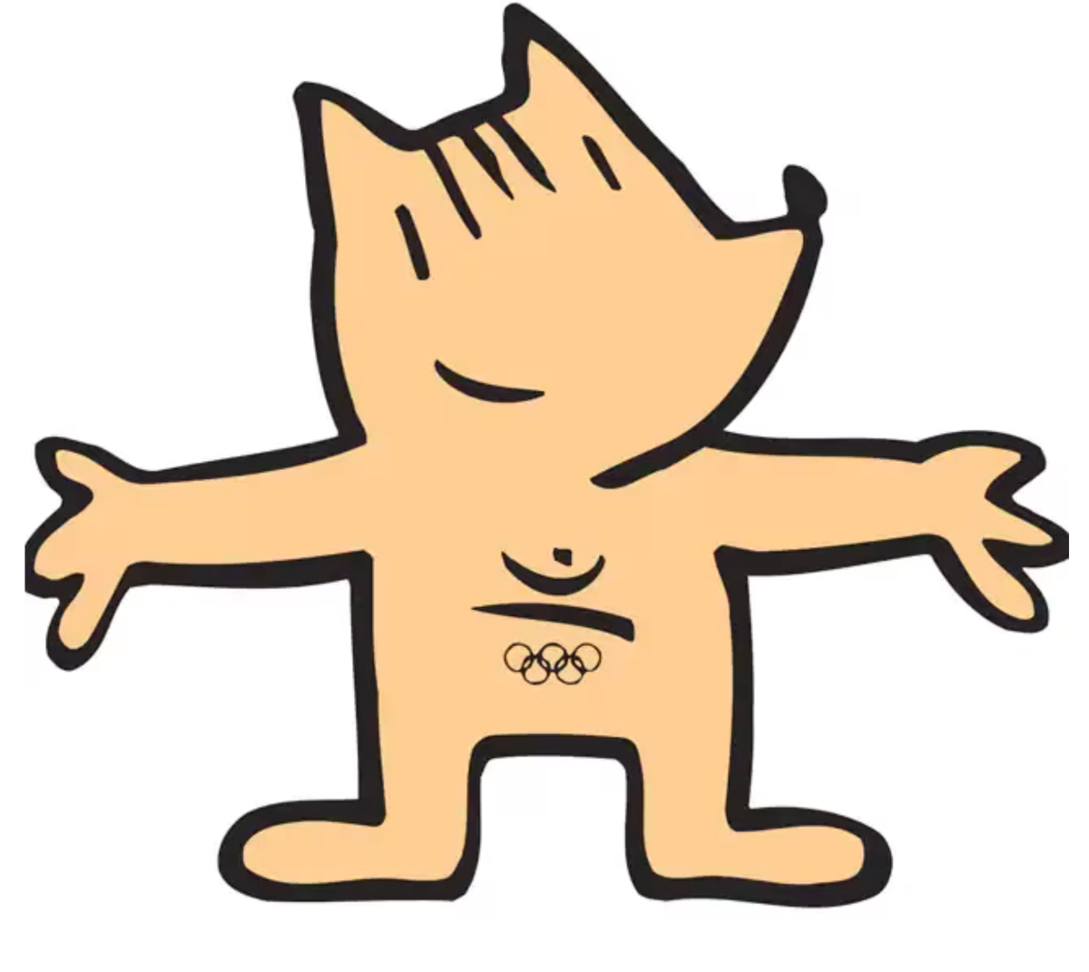
The 1992 Barcelona Mascot Cobi
Hodgson highlighted Cobi noting that, “The 1992 Barcelona mascot, Cobi, stood out for its unique, playful design that captured the spirit of the Games.”

The 1998 Nagano Japan Winter Olympics Logo
Sakaki described this logo as, “Depicting the beautiful and iconic bursting snow flower; simple yet elegant; the games are masterfully depicted in each petal.”
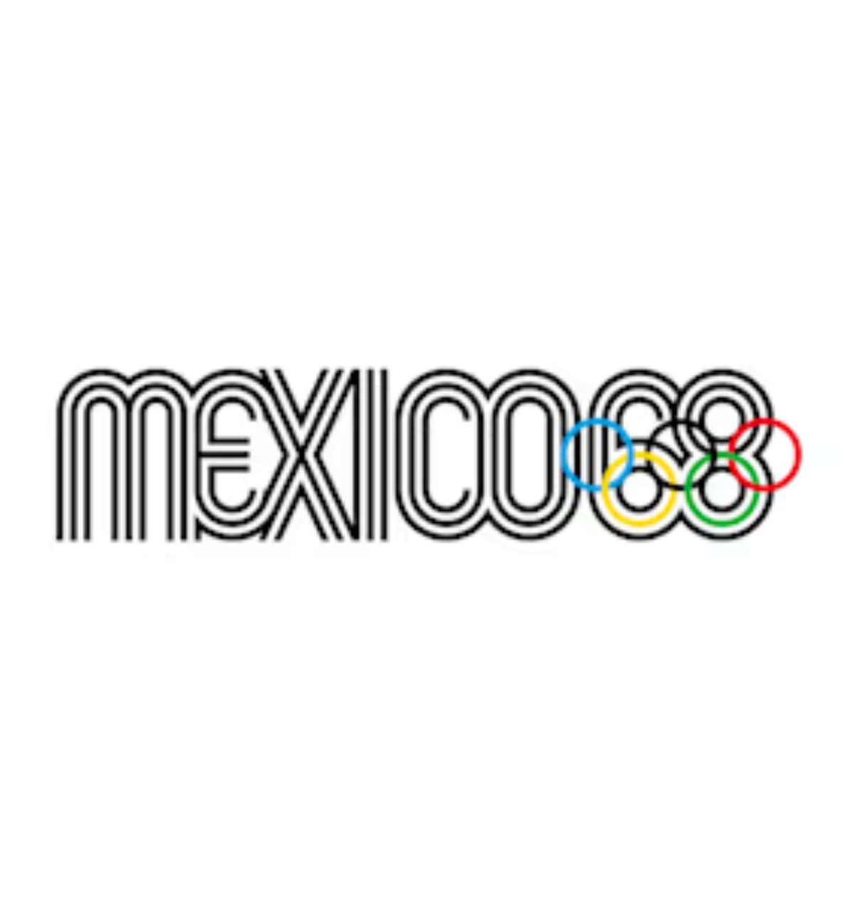
The 1968 Mexico Olympics Logo
Yeomans told Newsweek that “The logo that in my opinion, does its job most effectively is Mexico 1968. Having reviewed them all, it feels like the best of all time, as well as the bring the first identity that embraced the power of creating a recognizable, bold and iconic symbol.” Wright described the logo as, “A leap forward to an expressive typographic marque. Yeomans also noted that, “Mexico 1968 exudes culture, joy, connection, participation, and heritage.”
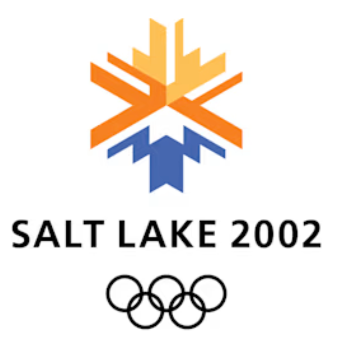
The 2002 Salt Lake City Olympic Logo
Sakaki highlighted this logo, stating that it “represents a patchwork of the native American quilt, the beautiful snow caped Wasatch mountains, and skies for the winter Olympic games.”
The Worst Olympic Logos and Mascots
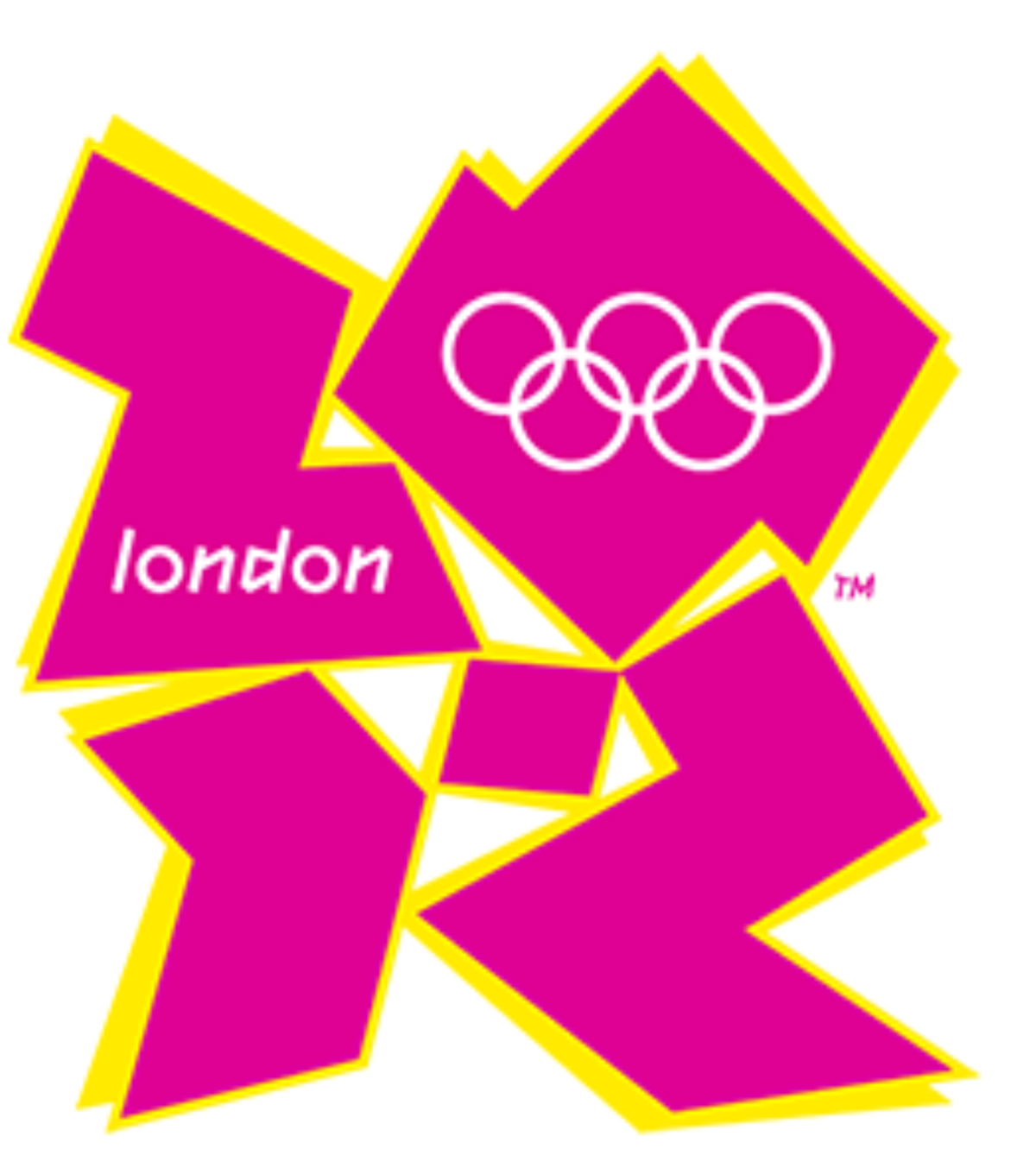
The London 2012 Olympic Logo
The logo for the London Olympics was hugely controversial at the time and remains divisive. Hodgson stated, “The London 2012 logo faced criticism for its abstract aesthetic and lack of immediate clarity, highlighting the importance of striking a balance between innovation and recognizability in design,” while Sakaki described it as, “way too busy and unfriendly with too many edges.” Ben Wright stated that, “The hugely controversial London 2012 logo created headlines in the national papers and was derided, but when the brand was rolled out it was regarded as being really successful much like the games themselves.”
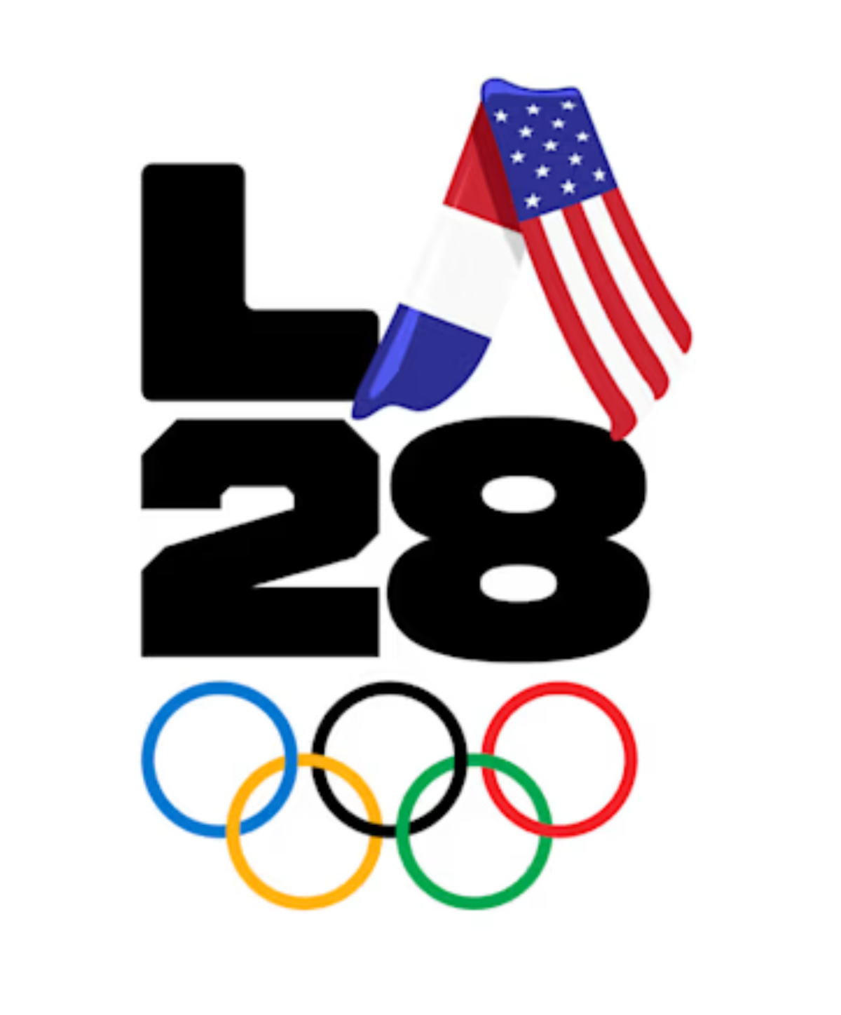
The LA28 Olympic Logo
The logo for the upcoming 2028 Olympics in Los Angeles has also been widely scrutinized. Sakaki told Newsweek that, “I am not keen on the 2028 LA Olympic Logo: it looks too predictable.”
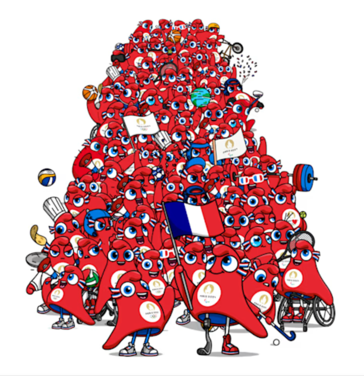
The Paris 2024 Olympic Mascot
The Paris Olympic Mascots have been widely derided. In an article posted on The Tab they are described as “slightly terrifying,” and “eerie,” and compared to a “crumpled Eiffel Tower.” Sakaki told Newsweek that the “French mascot reminds me of the “not so pleasant brown emoji” figure.” Yeoman’s noted that the, “The current Paris mascot has a difficult name for a global audience,” which goes against what she identifies is key for a successful mascot which is “A name that is easy to pronounce and remember.”
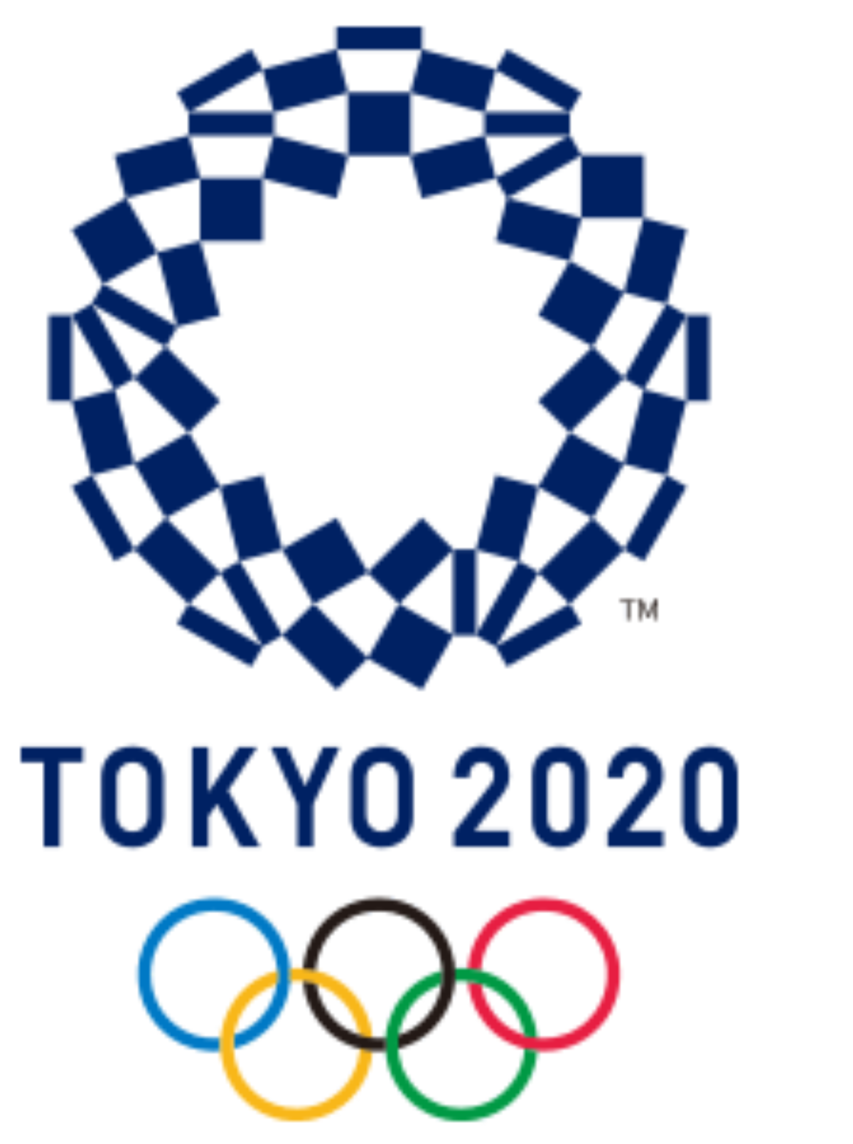
The Tokyo 2020 Olympic Logo
The Tokyo Olympic logo courted significant controversy at the time, with the original logo having to be scrapped due to plagiarism allegations. The final logo was described by Wright as feeling “Safe and less adventurous.” He applied the same criticism to the LA28 logo and the 2016 Rio Olympic logo, noting that, “Maybe this is a reflection of the reaction from the 2012 logo and growing political significance of the games, which is a shame.”
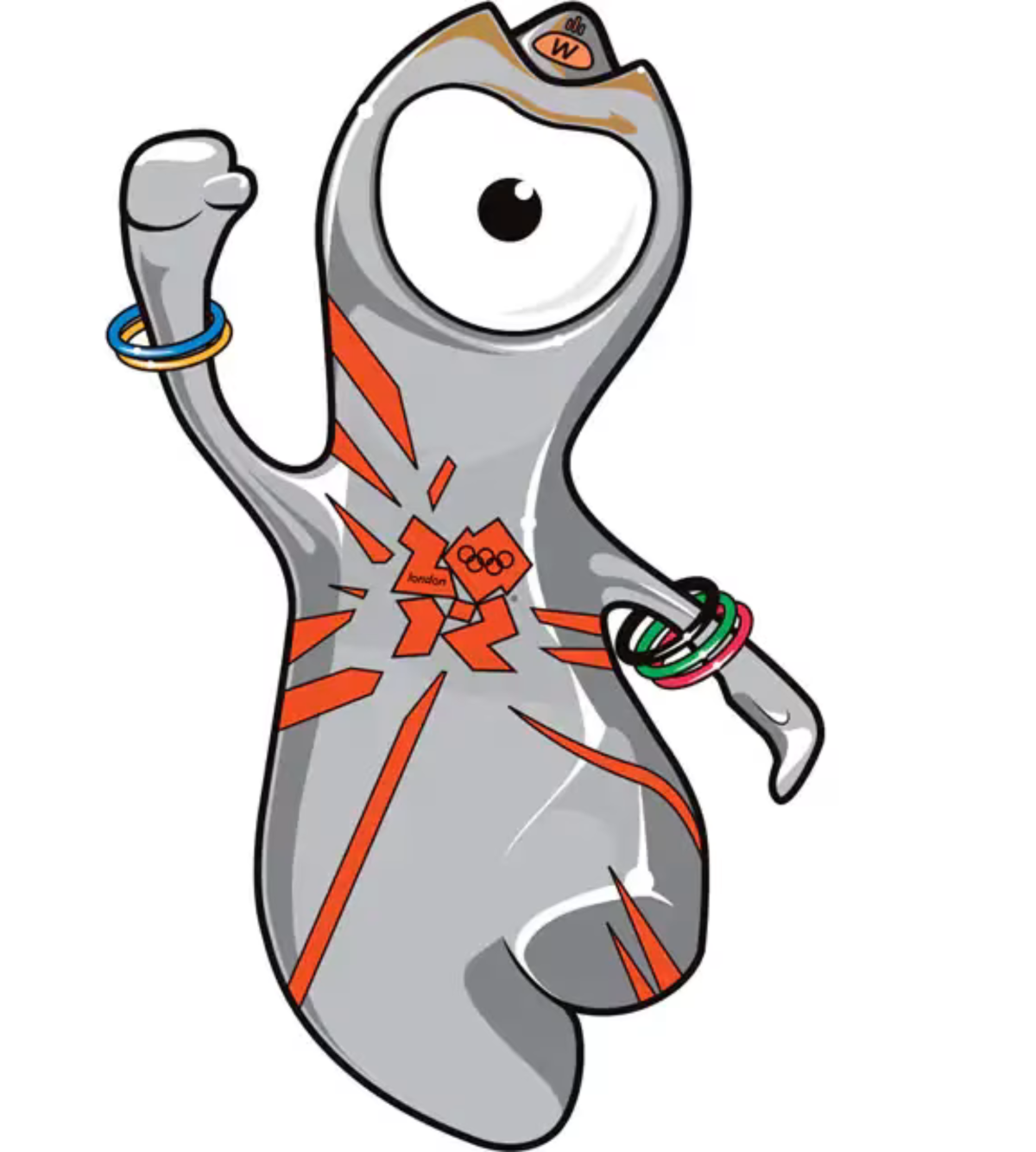
The London 2012 Olympic Mascot
“London’s 2012 Wenlock was shame,” Yeomans told Newsweek. She explained that “I went to those Olympics with my 12-year-old son and husband, and I don’t even remember seeing the mascot. If we did, we probably walked straight past, as the mascot did not fulfil any of our expectations of a friendly, loveable character. “
Do you have a story Newsweek should be covering? Do you have any questions about this story? Contact LiveNews@newsweek.com.

